Case Study for Restaurant Support App
Project overview
The problem:
Restaurant owners and managers need to improve the efficiency of day-to-day restaurant operations by streamlining tasks such as reservation management, order processing, and inventory control.
The goal:
Create a comprehensive digital solution that empowers restaurant owners, managers, and staff to streamline their restaurant operations, enhance customer service, and improve the overall management and financial performance of the establishment.
My role:
Lead UX designer, UX researcher, and visual and interaction designer designing a restaurant support app for restaurant owners and managers.
Responsibilities:
Conducting interviews, paper and digital wireframing, low- and high-fidelity prototyping, conducting usability studies, accounting for accessibility, and iterating on designs.
Understanding the user
User research: summary
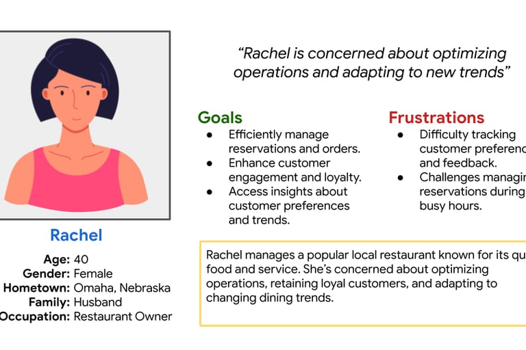
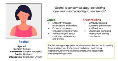
Rachel, a 40-year-old restaurant owner, represents the business perspective. Striving for operational efficiency and customer loyalty, she seeks tools to streamline reservation and order management, customer engagement, and data analysis. The app can address her challenges of managing reservations during busy periods and limited technology resources, enabling her to make informed decisions and enhance the overall dining experience at her establishment.
User research: pain points
Challenges in managing reservations during busy hours.
Pain point
Difficulty tracking customer preferences and feedback.
Limited resources to invest in technology.
Challenges of staying current with evolving dining trends, such as dietary preferences, sustainability practices, and tech-driven experiences.
Persona: Rachel
Problem statement:
Rachel is a restaurant owner who needs an efficient reservation and order management system because she has difficulties tracking customer preferences and feedback during busy hours
User journey map
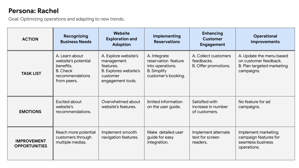
This map highlights the app’s role in addressing Rachel’s pain points and needs.
1
4
3
2
Pain point
Pain point
Pain point
Starting the design
Paper wireframes
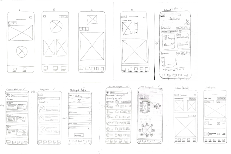
Each screen of the app was iteratively drafted on paper, ensuring that the elements that made it to the digital wireframe would adequately address user pain points. For the dashboard, I provided a high-level view of the restaurant's daily operations.
Digital wireframes
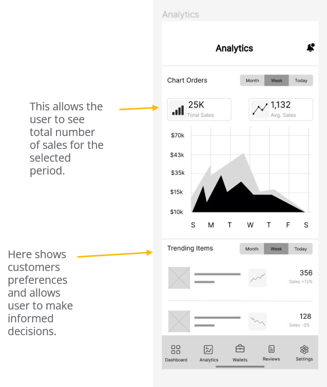
This wireframe outlines the analytics and reporting section, including visual representations of reservation trends, revenue, and customer preferences.
Low-fidelity prototype
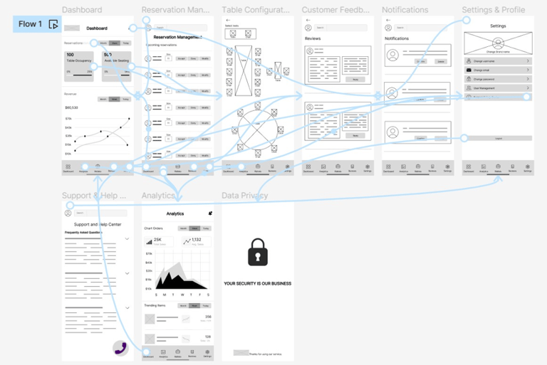
The low-fidelity prototype connected the primary user flow of efficiently managing reservations and orders for easy tracking of customer preferences and feedback during busy hours.
View the Restaurant Support App
Usability study: findings


Refining the design
Mockups
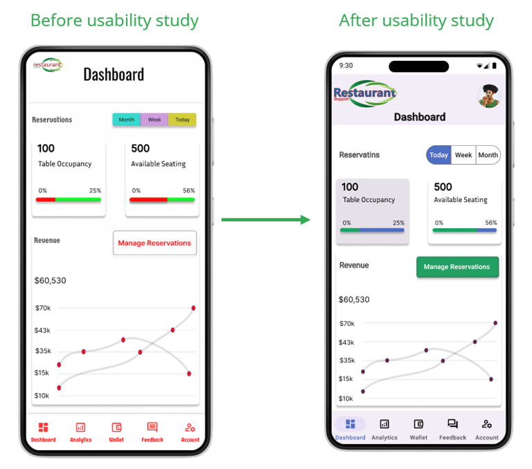
After the second usability study, I changed the text color of the reservation management button to white on a green background. Also, the color of the menu bar icons was changed to blue for the active state and black for the inactive state.
High-fidelity prototype
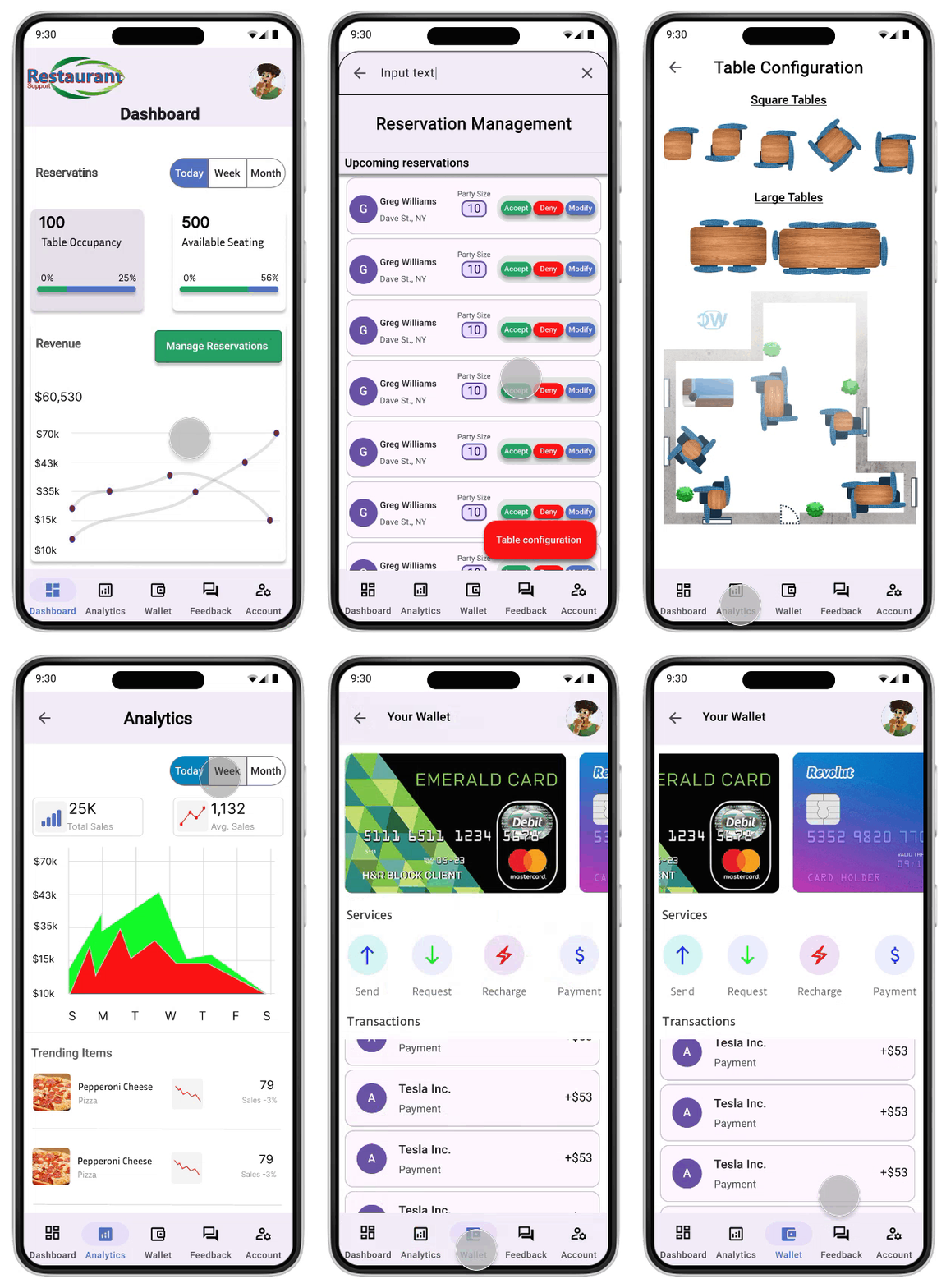

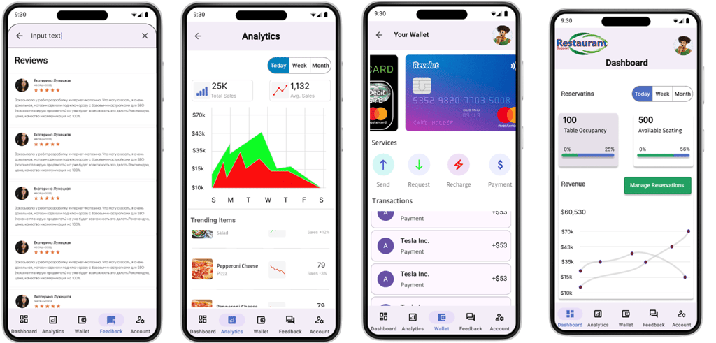
The final high-fidelity prototype presented a cleaner user flow for the restaurant support app. It also met the user's needs for managing reservations during busy hours and tracking customer preferences and feedback.
View the restaurant support app high-fidelity prototype
Accessibility considerations
Takeaways
